Introduction
Tailwind UI is a popular UI component library and design system built with Tailwind CSS, a utility-first CSS framework. It provides a set of pre-designed UI components and templates for front-end engineers. Tailwind UI aims to help developers create beautiful and consistent user interfaces by providing a comprehensive set of building blocks for common UI patterns, such as buttons, forms, navigation menus, modals, alerts, and more.
However, design teams, who often work in design tools like Figma, do not have a direct equivalent of the Tailwind UI component library within their design environment. While Tailwind UI has made the development workflow more efficient for developers, the same level of efficiency and consistency is not readily available for designers working in Figma.
At Neo.Tax, we faced a similar challenge when we decided to adopt Tailwind UI in our development workflow. While Tailwind UI provided a comprehensive set of pre-built components and templates that streamlined our development process, our design team working in Figma did not have access to the same component library. This created a disconnect between the design and development phases, leading to a significant amount of effort to align our designs with the Tailwind UI components used by our developers.
Initially, our designers created UI elements and layouts from scratch in Figma, without the benefit of a pre-existing component library that matched Tailwind UI. As a result, they often designed components that did not directly correspond to the pre-built components available in Tailwind UI. This mismatch required our developers to either recreate the designs from scratch or invest substantial time modifying the existing Tailwind UI components to match the designs.
Furthermore, as Tailwind UI received updates and introduced new components, we faced challenges keeping their custom-built design components in sync with the latest changes. This lack of parity between the design and development components hindered our ability to maintain a consistent and up-to-date design system across our applications.
To address this issue, we embarked on building our own Figma component library that closely aligned with the components and design principles of Tailwind UI. The rest of this article details our journey to create a highly flexible component library, our learnings, and the dead-ends we faced. This piece will also serve as “lite” documentation of the Figma files we released into the community.
These files for download can be found here:
Atoms, Molecules, and Organisms
Existing libraries
At Neo.Tax, we’ve explored various approaches to building UI component libraries within Figma. While these methods have their merits, we’ve encountered significant limitations that hinder our ability to maintain a consistent and up-to-date design system.
One common approach is to manually create individual frames or groups for each UI element, such as buttons, input fields, and cards, within the context of example page layouts. Designers intend for these elements to be copied and modified as needed throughout the design process. However, this manual process can be time-consuming and prone to inconsistencies, as similar elements often need to be recreated multiple times across different layouts. Further, each time something is modified, variations are introduced like a game of telephone. Eventually two buttons can look almost nothing alike.
To accommodate the various states and permutations of UI elements, such as different button styles or input field states, designers often create numerous Figma Components (reusable elements) with multiple Component Variations (an alternative design for an element, that can be easily swapped out, all stored under one Figma Component). However to cover all necessary use cases and interactive states, there can be over 100 variations for one component. This approach aims to capture every possible scenario, but it also leads to a vast number of components that can be challenging to maintain and update consistently.
When a design change needs to be applied across multiple variations of a component, designers must update each variation individually. This process is extremely time-consuming, especially when dealing with hundreds of component variations. Ensuring uniform updates across all variations of a component becomes a significant challenge.
Furthermore, the nature of component variations in Figma can limit the flexibility of UI elements. Once a component has been created with multiple variations, it becomes increasingly difficult to make minor adjustments or introduce new variations that deviate from the existing structure. Designers may need to break the component to accommodate even minor changes, further increasing the workload and potential for inconsistencies.
As our design system grew in complexity and our projects scaled, these limitations became more apparent. We recognize the need to explore alternative approaches that can better streamline our design process, maintain consistency across our UI elements, and facilitate smoother collaboration between our designers and developers. This realization has led us to investigate new solutions that can address the challenges we’ve faced with existing library approaches within Figma.
Initial Approach
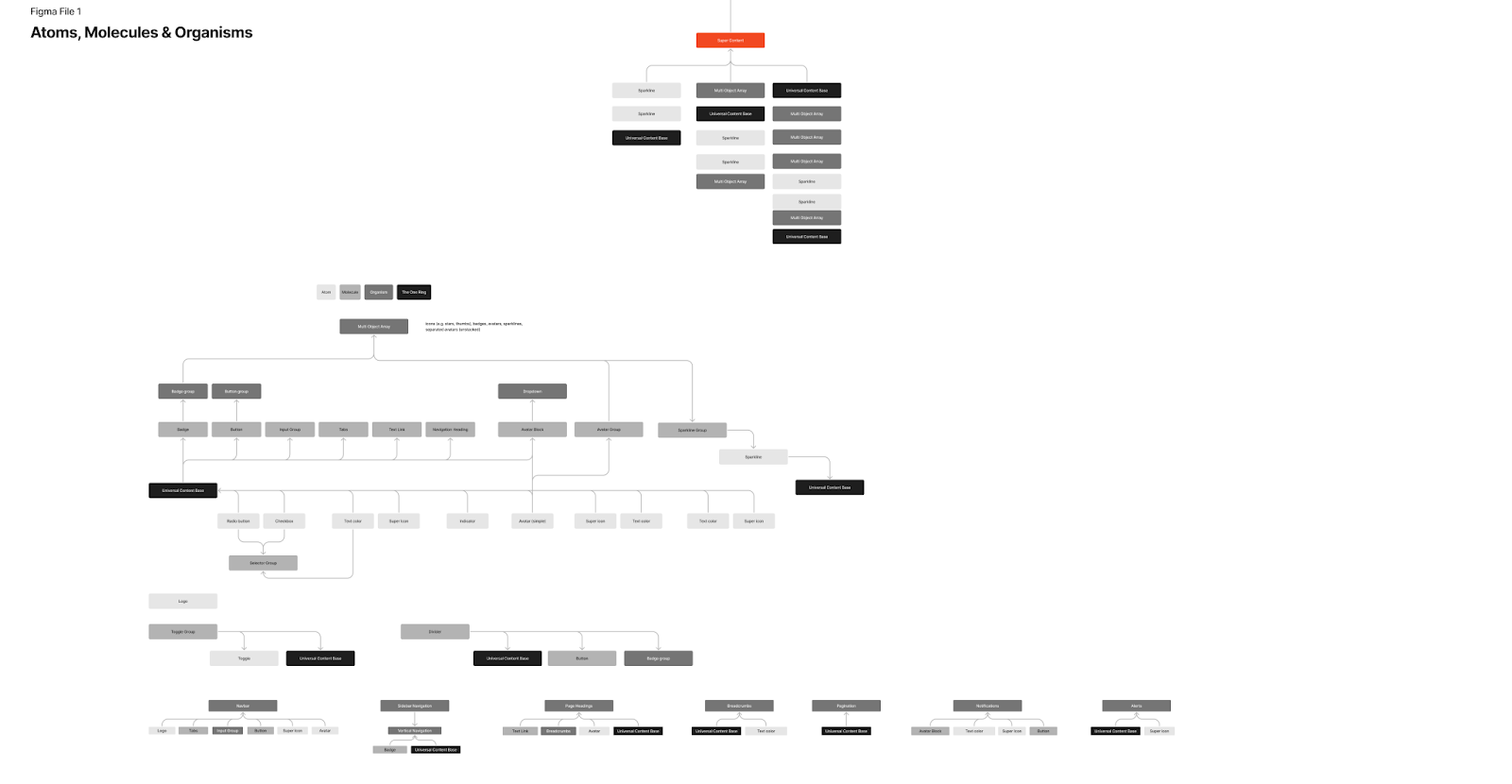
When Neo.Tax first set out to update its Tailwind UI components, we made some assumptions about the approach it would take. Originally, the plan was to utilize a strict atomic design system with multiple levels of inheritance. For those unfamiliar, the “atomic design system” (ADS) approach refers to a methodology for designing and building user interfaces that breaks down the design process into smaller, modular components. This approach is inspired by the principles of chemistry, where atoms are the fundamental building blocks that combine to form more complex molecules and compounds.
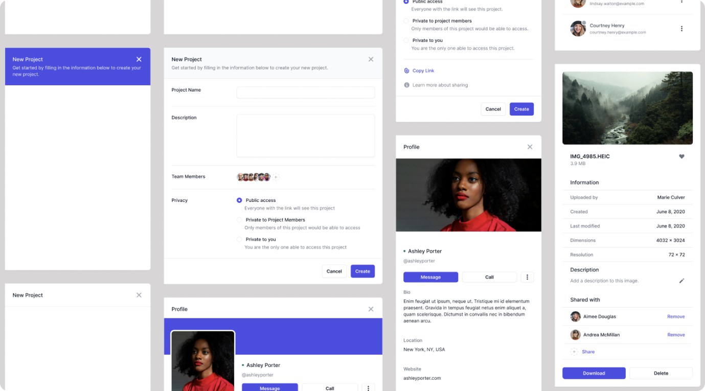
Thus, UI components are organized hierarchically, starting with the smallest, most basic elements (like buttons, labels, and icons) called “atoms.” These atoms are then combined to create more complex components called “molecules” (e.g., form inputs, navigation menus). Molecules, in turn, are combined to form “organisms” (e.g., headers, footers, sidebars), which are further assembled into “templates” representing the overall structure of a page or layout. Finally, these templates are combined to create complete “pages” or final user interfaces. This modular approach allows for greater consistency, scalability, and reusability of design components across an entire system or application.
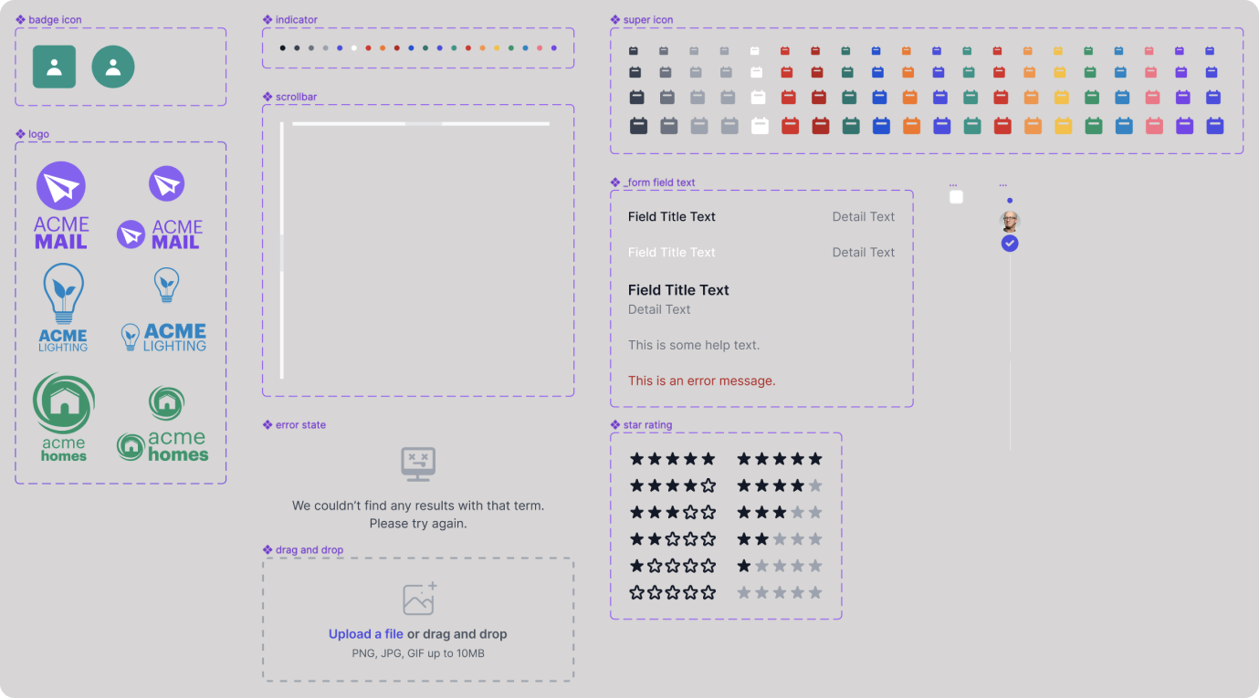
In our application of ADS we would start with a series of atoms (icons, buttons, badges, etc.). Of note, we created some fairly powerful atoms:
- Selector Object - a swappable checkbox or radio button
- Indicator - a small circle that indicates a state or status
- **Avatar **- images for sample users and companies
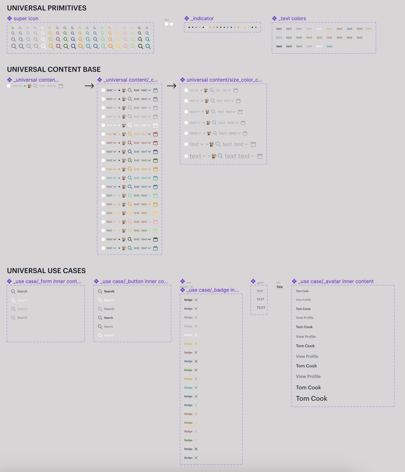
- **Super Icon **- a container that ensures consistency with size and color when using or adding new icons
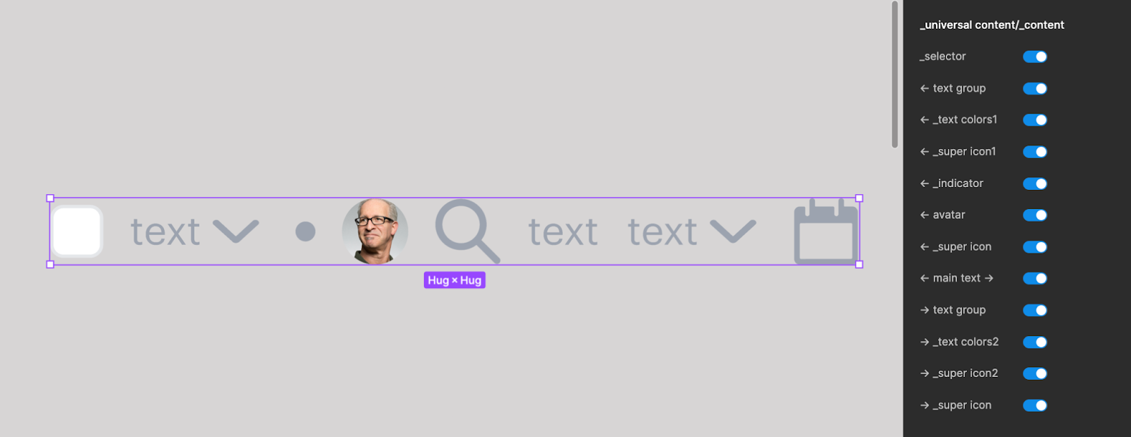
To make our system extremely flexible, many of these atoms would functionally be rolled up into a base element we would call the Universal Content Base (UCB). This UCB would contain a combination of all atoms that we often see around each other (text, icons, avatars, etc). These were styled and could be toggled on and off to create variations and would be used in most of the other atoms as a base. Consider a table cell, or drop down menu, a nav menu, etc; in each situation you could imagine designers wanting tons of combinations:
- Icon + text
- Text + icons
- Avatar + text + icon
- Avatar + text + lighter supportive text + icon
- Etc
In short, the UCB would provide a super powerful element; and critically, because all possible elements were present (put a pin in this — it comes back later), designers could quickly add or subtract visual elements with a toggle.
This solution had numerous benefits over the existing component libraries in that it would prevent designers from having to “break” a molecule or organism just to add an icon. Further, unlike variations, where each permutation would have to be updated if there was a change, this component would be updated in only one place.
After building the UCB, our atoms began being assembled into molecules (badges, buttons, dropdowns, etc.) and organisms (calendars, stats, headers, etc.). Because the goal was to maximize configurability and reuse at the lowest levels, in almost every situation where we had text, we used the UCB — and we saw a huge amount of flexibility; everything we had hoped for, until…
Assumptions & Solutions
When we started working on the tables, things stopped going so well. Under the hood, even when hidden, Figma was still rendering every atom. Consider a UCB with 10 elements:
- Selector (e.g. checkbox)
- Leading text
- Leading icon
- Indicator
- Leading avatar
- Main icon
- Main text
- Supporting text
- Supporting icon
- Trailing icon
It turned out that even if you only had visible the main text, the figma system was storing (file size) and rendering (active memory) every other of the 9 hidden atoms. In reality, we had 10 atoms in the UCB — and hundreds of UCBs across all our molecules. During testing, we found that this would lock up the UI as it struggled with the file sizes, even crashing the Figma preview at times.
Initially, we thought this was a problem to just push through, since the underlying component library wasn’t needed to be fast, just “there” for other files to import. However, our optimism didn’t last long. After one file grew over 100 megabytes and crashed Figma, freezing the entire UI, the team knew their initial approach would not work. The solution to our level of configurability was creating bloat and performance issues. At this point, debates emerged about how to support reuse while keeping components lightweight. Ultimately, the decision was to make three key changes: multiple figma files, strategic use of variations, and leveraging Figma’s suggested replacement system.
From One To Many
After moving away from an overly granular atomic design system, we decided that splitting the components across multiple files would improve performance. This way, no single file would grow too large, helping to avoid the crashing issues.
Our first file contained the foundational building blocks of our design system, encompassing basic elements like text and buttons, known as atoms, as well as more complex components like input fields and navigation bars, referred to as molecules and organisms. This file served as a comprehensive catalog of reusable UI primitives.
The second file housed more advanced components built by combining atoms and molecules from the first file. This included composite elements such as tables, feeds, grid lists, and forms, among others. These components were composed of reusable parts from the foundational elements in the first file, making it easier to maintain consistency and update styles across the entire system.
The third file focused on flexible layout systems designed to arrange and position the higher-level components from the second file. These layouts provided a framework for structuring content and components on various page templates, ensuring a consistent visual hierarchy and spatial relationships between elements.
By separating our component library into these three distinct files, we were able to better manage the complexity of our design system and mitigate performance issues caused by a single, bloated file. This approach allowed us to isolate different levels of components, making it easier to navigate and maintain each file. Additionally, by building higher-level components from reusable primitives in the first file, we could ensure consistent updates and styling across the entire system, reducing the risk of inconsistencies and decreasing the workload for our designers.
Embracing More Variants
In addition to splitting our component library across multiple files, we also adopted a more strategic approach to component variants. While we maintained a Universal Content Base (UCB) that served as a foundation for our components, we moved away from creating a single, monolithic component to one with numerous variations.
Now, the UCB has six distinct levels of complexity. For example, a button component might have six variations, ranging from a “bare bones” version containing just an icon, text, and another icon, to a “Swiss army knife” variation that incorporates a multitude of features and configurations.
By default, our designers now utilize the “bare bones” variation as the starting point for each component. This approach significantly reduces memory usage and file size, helping to mitigate the performance issues we faced with our previous approach.
However, when specific situations demand more complex functionality, designers have the flexibility to increase the complexity of a component by selecting a more feature-rich variation. This strategic usage of variations allows us to strike a balance between maintaining a lightweight component library and accommodating advanced use cases when necessary.
Additionally, we created variations for different sizes (e.g., XS, S, M, L, XL) and semantic usage (e.g., placeholder, alert, primary, secondary). So while this does mean that our UCB has a large number of variations, that do need to be maintained by hand - as a central “universal” component, the flexibility we provide across the entire suite of components still allows us to scale up.
This approach not only improves performance but also enhances the maintainability of our component library. Designers can make updates to a specific variation without the need to touch underlying instances of the component, reducing the workload and potential for inconsistencies.
By adopting a strategic mindset when it comes to component variants, we have been able to streamline our design process while still providing the flexibility and configurability our designers require to create rich and engaging user interfaces.
Instance Swap
The third major change we implemented was taking advantage of Figma’s built-in “Instance Swap” functionality. This feature allows designers to include alternative components for elements within a component, rather than hard-coding every possible permutation in the component itself.
For example, within a card title component we might include placeholder slots for left-aligned elements, right-aligned elements, footers, and so on. We can then create a library of suggested component instances that commonly occupy those slots, such as icons, ratings, links, secondary text, and more.
By swapping suggested component instances into a placeholder slot, designers gain significant flexibility without the need to generate hundreds of predefined variations. At the same time, since unused component variations do not load into the file, this approach does not cause performance overhead.
We now strategically leverage instance swaps alongside component visibility toggles and limited variations where appropriate. For frequently accessed configurations, we rely on variations for optimal ease-of-use. For less common configurations, instance swaps provide flexibility without excessive complexity. And for dynamic configurations, component visibility triggers allow elements to show/hide based on context.
This targeted combination of approaches allows us to balance design flexibility, performance, and ease-of-maintenance within our component library. By relying on instance swap functionality for long-tail use cases, we can provide customization options without the complexity of managing countless hardcoded permutations. This ultimately creates a more sustainable system, facilitating consistency while empowering designers to build interfaces tailored to their specific needs.
Pushing the Possibilities
After settling on the multi-file component approach, we began considering how to make our Tailwind UI kit more beneficial for the wider Figma ecosystem. Rather than just meeting internal needs, we pondered how to make it a valuable open-source contribution.
We realized we could release the kit publically. This would allow the community to import exactly which components they need, keeping file sizes small. Beyond that, we looked at enhancements to make it more configurable for users.
We debated whether to strictly adhere to the standard Tailwind UI framework, or build out additional variants that we found useful. We decided that limiting components to the default Tailwind library would miss an opportunity. By expanding the kit with personalized variations, we could accelerate design for a wider range of users.
For example, we identified an opportunity to enhance the functionality of the description lists. Rather than rendering them as basic rows of content, we recognized their potential to serve as expandable accordions. By incorporating a chevron icon, we enabled users to reveal additional content beneath the main row, effectively transforming these elements into interactive components. Although this feature deviated from the initial design specifications, it aligned seamlessly with Tailwind’s philosophy of promoting utility and adding value to the library’s offerings.
Embracing an exploratory mindset also unveiled innovative opportunities for dynamic UI adjustments through the utilization of Figma’s local variables feature. While still in its beta stage, this functionality enabled the seamless integration of Tailwind UI’s border and spacing values into the design process. By leveraging local variables, users gained the ability to fine-tune visual elements like border radius effortlessly, without the guesswork typically associated with determining incremental value changes. Moreover, this approach facilitated the consistent application of standardized padding and spacing values across the entire design kit, promoting cohesion and adherence to established guidelines.
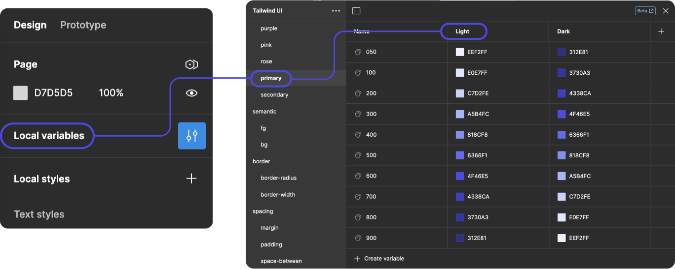
In addition to spacing and border values, we also realized we could include color palettes in the local variables. We embraced the concept of semantic colors, which involve assigning specific hues to represent particular states, actions, or contextual information. By introducing local variables with semantic color names, we aimed to streamline the implementation of values such as alerts and status indicators. This approach facilitated a more intuitive and consistent application of colors, ensuring that users could quickly grasp the intended meaning or severity of a given notification or status update. For instance, shades of green could signify success or positive outcomes, while reds could indicate errors or critical alerts. Leveraging semantic color names eliminated ambiguity and guesswork, enabling designers and developers to effortlessly incorporate meaningful color cues throughout the user interface. This enhancement not only improved visual communication but also fostered accessibility and a more cohesive overall experience.
In the end, Neo.Tax pushed the Tailwind UI kit beyond the official framework and customized it specifically for the Figma community. Instead of just updating an existing library, we focused on innovation and problem-solving for designers. This collaborative, user-focused approach amplified the value of the open-source release.
Figma Limitations
While building an extensive Tailwind UI kit for Figma, we maximized configuration through deep inheritance chains. This exposes all available component properties to designers for adjustment. However, we found that the configuration panel in Figma then becomes cluttered with excessive controls.
Without the ability to collapse and hide subsets of configurations, the panel displays every inherited style option. For complex components with deep atomic nesting, this creates noisy interfaces that are confusing and frustrating to designers.
We hope that more advanced interface features get added to Figma to streamline configurable components. Specifically, options to minimize atomic control groups would greatly improve usability. This would declutter the inspector panel and help designers focus on the most relevant customization keys.
In the interim, one workaround is to add emojis to group common atoms and signify their use. Another is to annotate specific configuration properties that should not be directly edited. Adding instructions for designers provides guidance on which controls to avoid adjusting due to inheritance issues. However, this is an imperfect solution as it relies on reading notes instead of solving the root cause.
As Figma expands what’s possible while building design systems, capabilities like configurable control visibility would resolve confusion from atomic inheritance overload. In the meantime, teams like Neo.Tax must creatively adapt around these platform limitations. Continued collaboration with the Figma community will hopefully drive innovations in critical areas like these.
Lessons Learned
Updating Tailwind UI presented both opportunities and challenges for us. By splitting components into multiple files and simplifying inheritance chains, we overcame technical limitations in creative ways. Our customized Figma design system pushes the possibilities of Tailwind while enhancing performance and usability. One lesson learned was that striking the right balance between configurability and complexity is essential to build usable systems. While limitations remain in widgetizing complex components, continued advancement of tools like Figma should open up new techniques. By sharing the innovations as open-source contributions, Neo.Tax aims to advance UI development best practices for the wider design community. This case study provides both technical insights and guiding principles for teams undertaking similar design system initiatives.
About These Files
This file is an updated version of the Tailwind UI for Figma, which leverages Figma’s powerful new features. It allows designers to quickly and easily create user interfaces. The improvements made to this version include:
- Switching from local styles to local variables, which provides more flexibility and consistency across components.
- Addition of useful components that are not available on the official Tailwind UI website, expanding the design options.
- Extensive use of inheritance, which promotes code reusability and maintainability.
With these enhancements, designers can streamline their workflow and create more consistent and robust interfaces using the updated Tailwind UI for Figma.
Where can I find them all?

File 1: Atoms, Molecules & Organisms
https://www.figma.com/community/file/1354840620455560519

File 2: Templates (Tables, Lists, and More)
https://www.figma.com/community/file/1354840787440642376

File 3: Layouts (Content, Dialogs, Slide-overs)
https://www.figma.com/community/file/1354840986804155722
File 1: Atoms, Molecules & Organisms
This system is based on the atomic design system with multiple levels of inheritance. For those unfamiliar, the “atomic design system” (ADS) approach refers to a methodology for designing and building user interfaces that breaks down the design process into smaller, modular components. This approach is inspired by the principles of chemistry, where atoms are the fundamental building blocks that combine to form more complex molecules and compounds.
This file includes the smallest, most basic elements (like buttons, labels, and icons) called “atoms,” which are then combined to create more complex components called “molecules” (e.g., form inputs, navigation menus). Molecules, in turn, are combined to form “organisms” (e.g., headers, footers, sidebars). As these are the most basic parts of a design they have been collected into this file to ensure that if you choose not to utilize the other two files, you can still use the Tailwind UI at its core.
File 2: Templates (Tables, Lists, and More)
Following atomic design, the atoms, molecules and organisms from the previous file are further assembled into “templates” representing the overall structure of a page. This includes tables, lists, feeds, and other complex components.
File 3: Layouts (Content, Dialogs, Slide-overs)
Finally, the templates are further assembled into more complex “layouts” representing the larger containers within a page.
Connecting Libraries
Why is there more than one library file?
Because we wanted a more fully featured library the components had to be split into multiple files to improve the overall performance. We used the atomic principles of design to split the components into the different files, enabling you to build from the most simple elements all the way up to full page layouts without a decrease in usability.
For more information on libraries in Figma, see their help article: https://help.figma.com/hc/en-us/articles/360041051154-Guide-to-libraries-in-Figma
How do I connect all the libraries in this set?
- From the community tab or using the links on the left, download all libraries
- Open file 1
- Under assets > library, publish the file 1
- Once that process has completed, open file 2
- Under assets > library, find file 1 and add it to file 2
- Once file 1 has been successfully added, publish file 2
- Once file 2 has completed publishing, open file 3
- Under assets/libraries, add both files 1 and 2
- Repeat these steps to include file 1 & 2 in your 3rd library
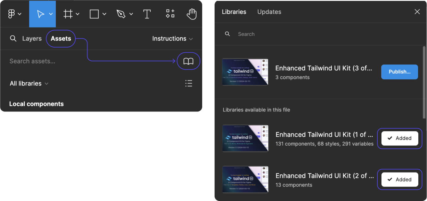
- Once both files have been successfully added, publish file 3
- Your files are ready to use!
How do I get updates?
Changes made to the original file are not reflected in duplicated files. You must duplicate the updated file to view any changes. At this time, Figma does not offer a way to simply incorporate the changes from the new file into your current file.
I can’t add my libraries.
Unfortunately, connecting external libraries is not available for Figma users on the free tier.
The styles in file 2 and 3 aren’t linked after I connect the libraries!
Unfortunately, Figma does not support the ability to keep the styles in subsequent files downloaded from the community linked, despite adding them as supporting libraries in the assets tab. The only method we have found to re-link these is to re-select them on each component.
Styles that become unlinked include:
- colors
- fonts
- Effects
If you do not change any of these styles in file 1, this is not an issue. All components function correctly despite this. However, if you update your brand colors in file 1, for example, these changes will need to be re-linked in files 2 and 3 for the inheritance to take effect. An alternative workaround is to use an external library for your branding, link it to each library, and integrate those branded styles into the components rather than relying on file 1’s styles.
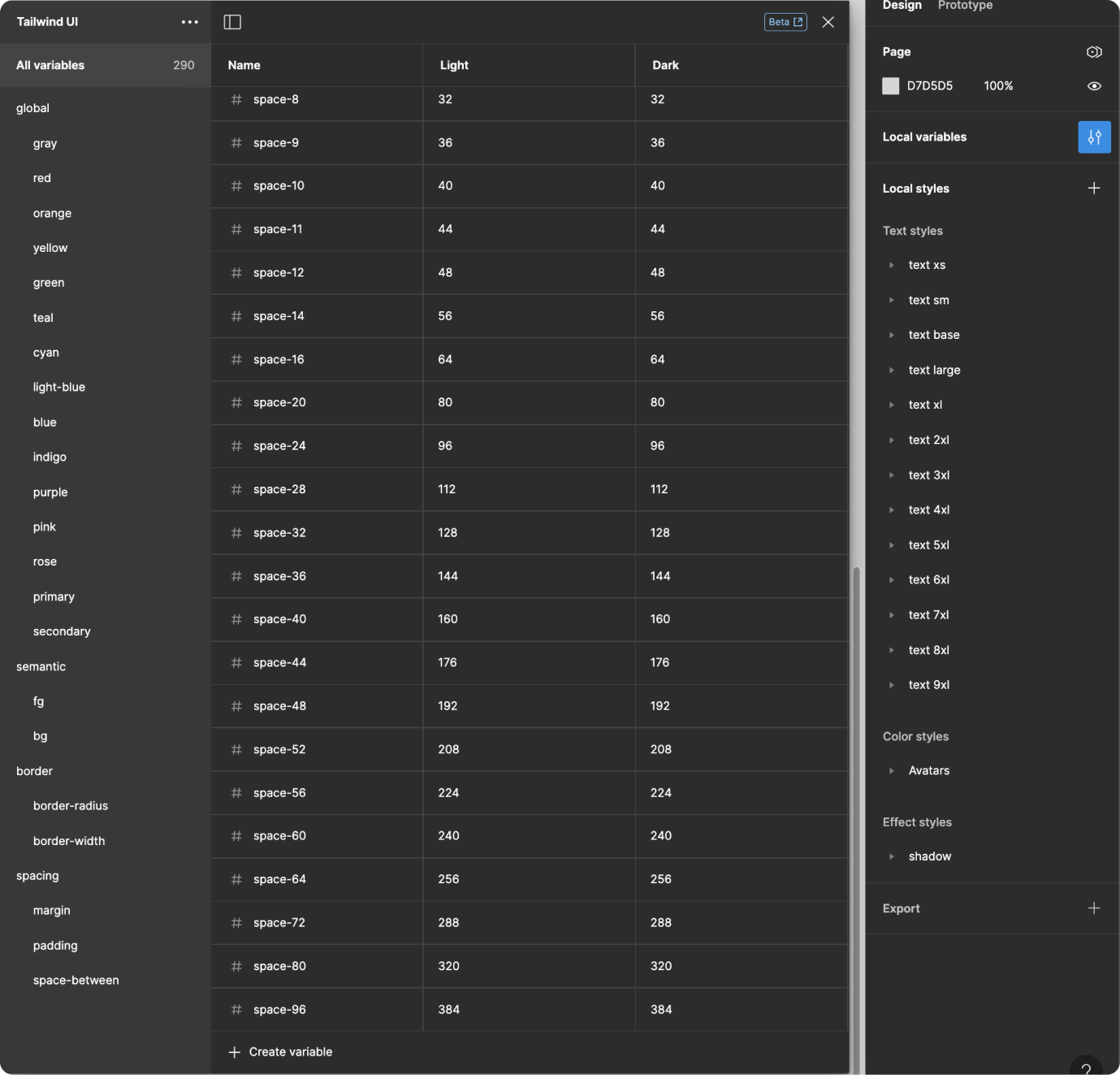
Variables & Style Library
Does this file still use the Local Style Library?
We are moving towards using local variables as they are more flexible for the purposes of this kit. Not only can we offer all of the main Tailwind UI colors, but with the flip of a toggle you can view the designs in either a light kit or a dark kit. This system also allows the flexibility of semantic colors for styles such as alert, success, warning, and more. Of course, where it makes sense (such as avatars or colors with opacity or linear styles) we will certainly add local styles as needed.
To learn more about variables in Figma, see their help article: https://help.figma.com/hc/en-us/articles/15339657135383-Guide-to-variables-in-Figma
Variables
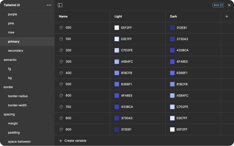
How do I change brand colors?
You have several options for including your brand colors and elements. The first option is the include an external library with those colors. To do this, follow the instructions for adding a new library.
The second option is to change the colors within the local variables in file 1. To do this, follow these instructions:
- Open Local Variables
- Select Primary or Secondary
- Change the Light & Dark columns
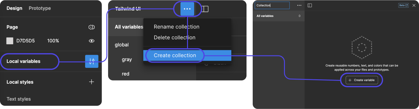
A third option is to include your brand colors as a separate collection within the local variables. To do this, follow these instructions:
- Open Local Variables
- Select the 3 dots to the right of the current collection name
- Select “Create Collection” in the dropdown
- Name your new collection
- Then click “Create Variables” to add your colors
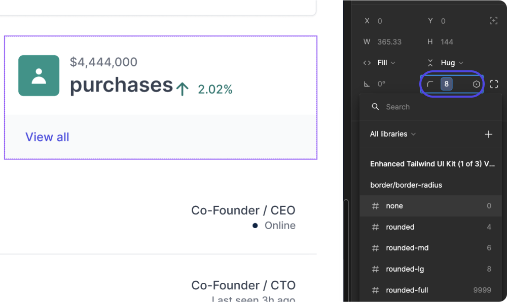
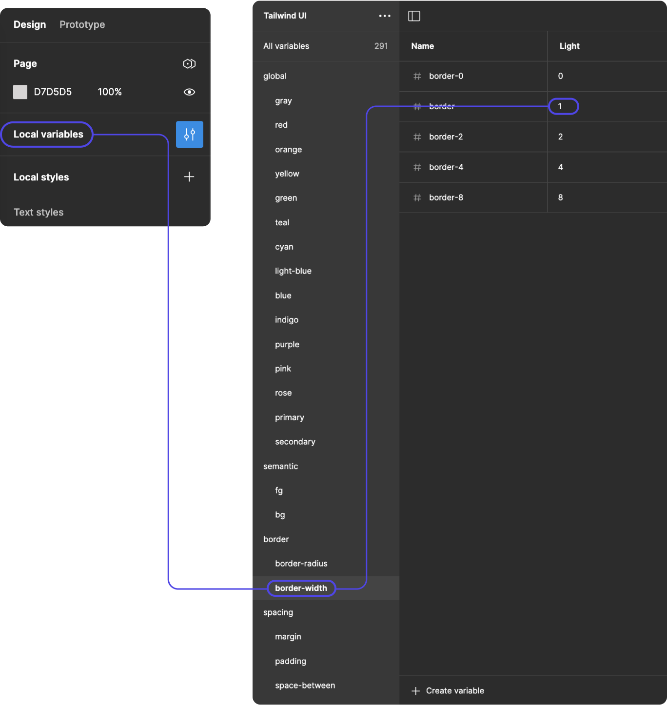
How do I change the border radius?
Border-radius is a property that allows you to round the corners of an element’s border. It specifies the radius of the border corner curves.
There are two ways to change the border radius within this library. Globally, or on individual components.
To change the values on individual components:
- Click on your component and find the radius you’d like to adjust
- Click on the value
- A dropdown will appear with the predetermined numbers
- Choose the value you prefer
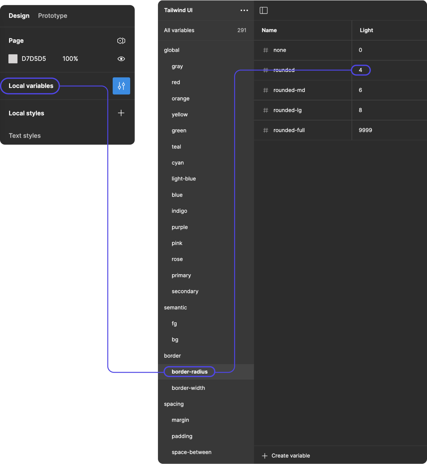
To change the values globally:
- Open Local Variables
- Select the border-radius category
- Adjust the values as needed
How do I change the border width?
Border-width is a property used to specify the width of the border around an element.
There are two ways to change the border radius within this library. Globally, or on individual components.
To change the values on individual components:
- Click on your component and find the border width you’d like to adjust
- Click on the value
- A dropdown will appear with the predetermined numbers
- Choose the value you prefer
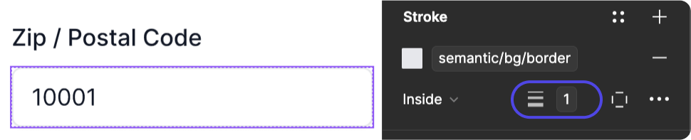
To change the values globally:
- Open Local Variables
- Select the border-radius category
- Adjust the values as needed
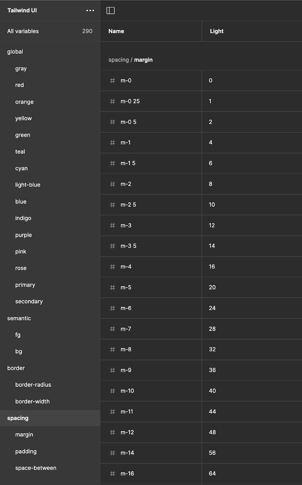
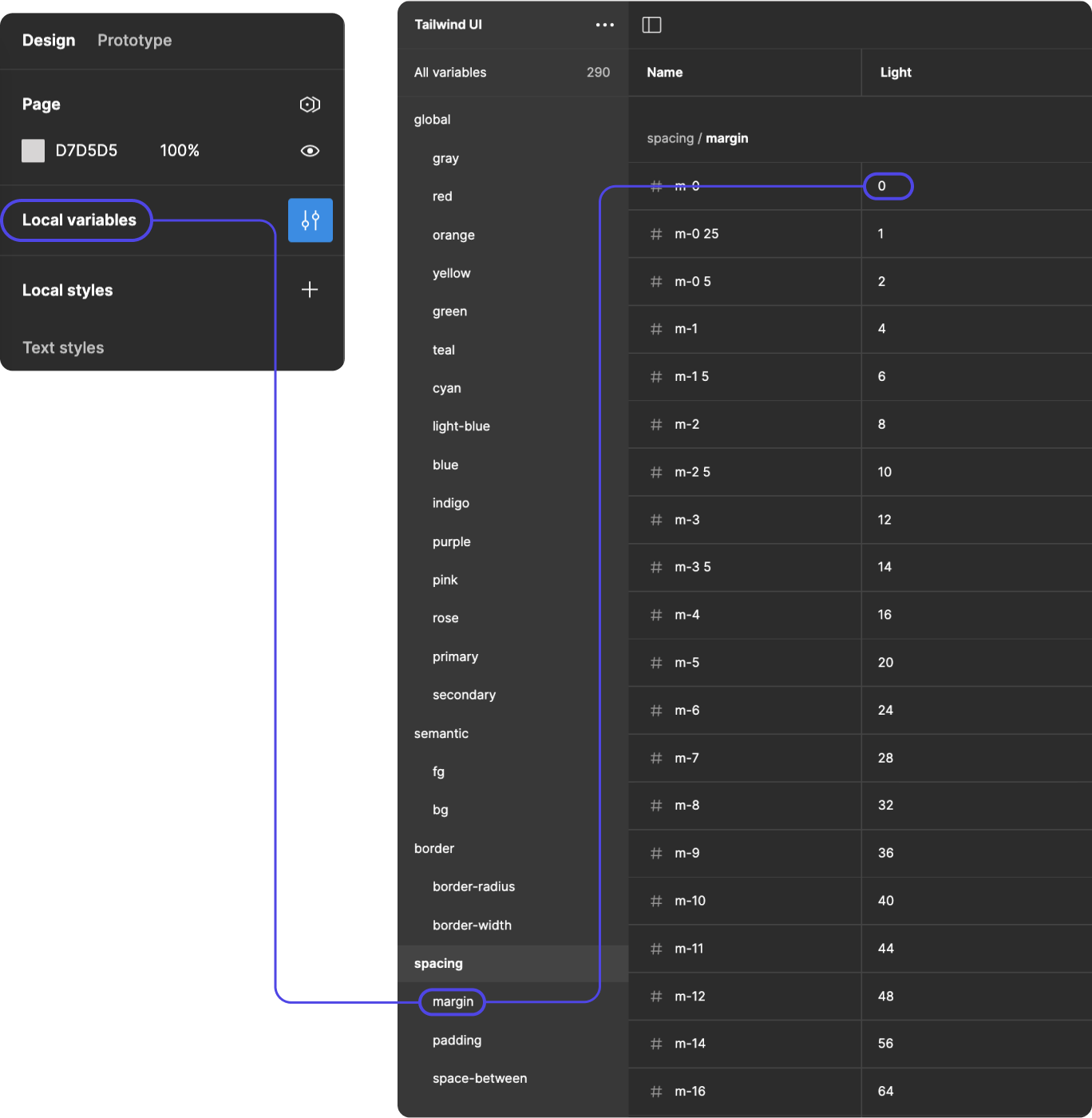
How do I change margin or padding spacing?
Padding refers to the space between the content of an element and its border. It is used to increase the space between the content and the border of an element, thereby affecting its overall size and appearance.
Margin refers to the space outside the border of an element. It controls the distance between the element and adjacent elements in the layout.
There are two ways to change margin or padding spacing within this library. Globally, or on individual components.
To change the values on individual components:
- Click on your component and find the margin you’d like to adjust
- Click on the value
- A dropdown will appear with the predetermined numbers
- Choose the value you prefer
To change the values globally:
- Open Local Variables
- Select the category you’d like to change
- Adjust the values as needed
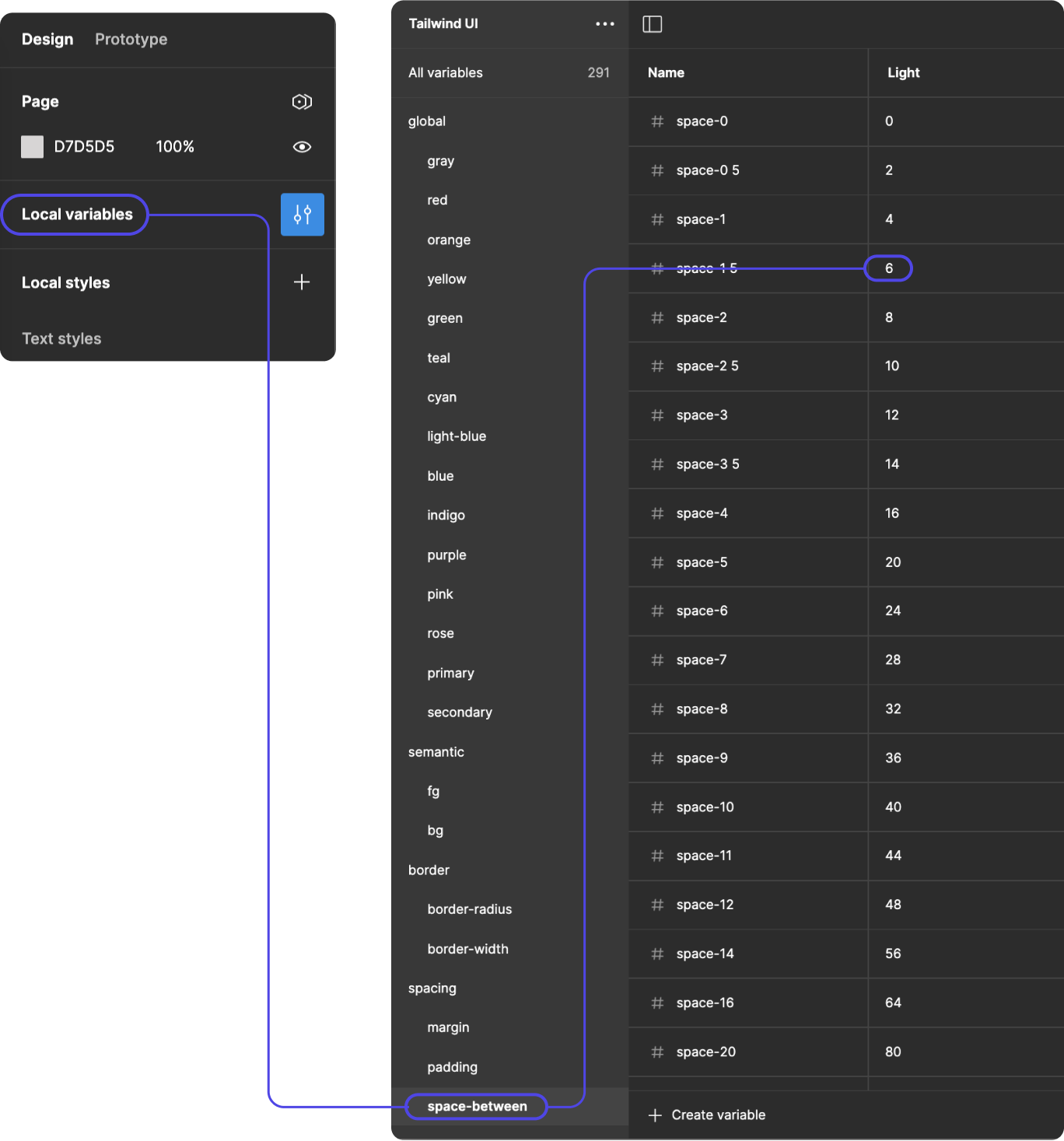
How do I change the space between elements?
Space-between is a value for the justify-content property, which is used in flexbox layouts to align and distribute flex items along the main axis.
There are two ways to change the space between elements within this library. Globally, or on individual components.
To change the values on individual components:
- Select your component
- In the auto layout panel, click on the value that you’d like to change (in this example, the space-between)
- A dropdown appears with pre-set values from the Local Variables settings
- Adjust the value as needed
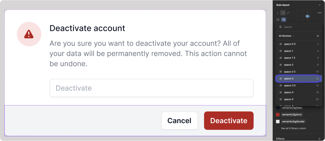
To change the values globally:
- Open Local Variables
- Select the category you’d like to change
- Adjust the values as needed
How do I swap the dark/light kit variables?
In Figma, the light and dark kits are each called modes. You can switch modes on:
- Layers
- Frames
- Components and component sets
- Sections
- Groups
- Pages
- Select the layer or component that you would like to change
- In the auto layout panel, click on the layer toggle
- A dropdown appears with pre-set values from the Local Variables settings
- Select the color values you would like to use
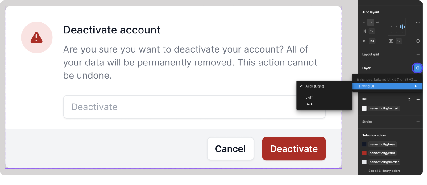
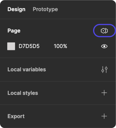
If you are changing the color options on a full page, you can find the toggle on the page selector in the right panel.
I can’t use/change the dark variables.
Unfortunately, the second column of variables are not available for Figma users on the free tier.
Icons & Avatars
What’s the difference between an icon and an avatar?
“Avatar” and “icon” are both visual elements used in various contexts, often in digital interfaces, but they serve different purposes and have distinct characteristics.
Avatar:
- An avatar is typically a representation of a user, often in the form of a profile picture or image. It can be a photograph, an illustration, or a graphic that symbolizes a person, often associated with an account or identity in online platforms, social media, forums, or messaging applications.
- Avatars are usually used to personalize user profiles, provide visual identification, and add a human touch to digital interactions.
- Avatars can convey emotions, personality, or identity, making them a central element in social networking and online communities.
- They are often larger in size compared to icons and may contain more detailed imagery.
Icon:
- An icon is a small, simplified graphical representation of an object, action, or concept. Icons are commonly used in user interfaces to convey information quickly and intuitively.
- Icons are designed to be universally recognizable and easily understood, often using simplified shapes, symbols, or glyphs.
- They are used for various purposes such as indicating navigation elements (like menu items), representing actions (like save or delete), conveying status (like warning or success), or highlighting features.
- Icons are typically smaller in size compared to avatars and are often used in buttons, toolbars, menus, and other UI elements to aid users in understanding functionality and navigation.
Why aren’t more icons and avatars provided?
We understand that designers often have their preferred icons and avatars. To facilitate your design process, we’ve included a diverse selection to kickstart your project. We recommend that you create your own library with these elements and make them a dependency in this library to use your assets in these designs.
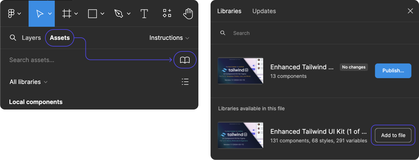
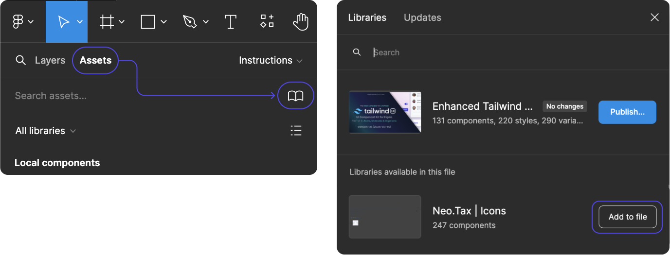
How do I connect my libraries for my icons, avatars, and other assets?
- Open Assets
- Select the Library Icon
- Find your published library and select “Add to file”
For more information on libraries in Figma, see their help article: https://help.figma.com/hc/en-us/articles/360041051154-Guide-to-libraries-in-Figma
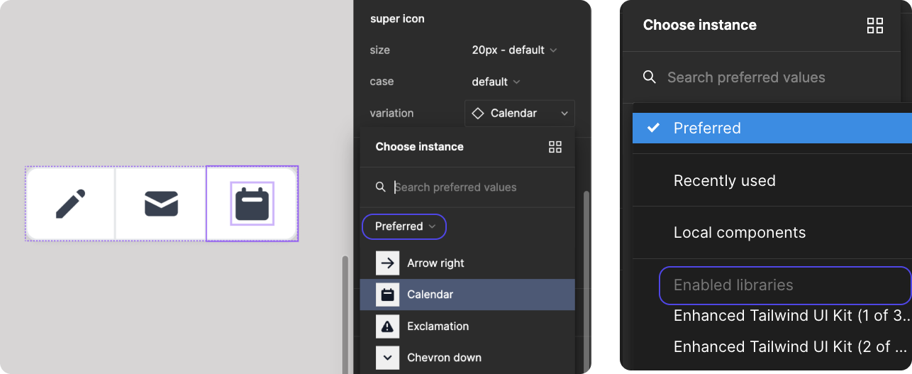
How do I change icons?
- Select the element with the icon that you would like to change
- In the right panel, find the instance of the icon
- Click the “variation” dropdown to see the suggested replacements
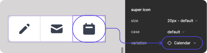
- If you would prefer to use a different icon than the ones listed, click the “Preferred” dropdown to open a menu to find more local components or additional enabled libraries
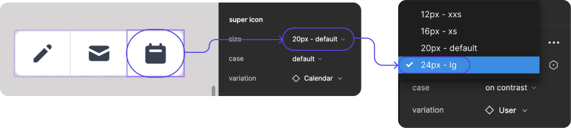
How do I change icon size?
- Select the icon that you would like to change
- In the right panel, find the instance of the icon
- Click the “size” dropdown to see the suggested replacements
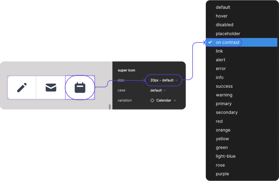
How do I change icon color?
- Select the icon that you would like to change
- In the right panel, find the instance of the icon
- Click the “case” dropdown to see the suggested replacements
How do I change avatars?
Avatars do not (yet) work within the local variables. Instead, these live within the local styles, which can be found at the bottom of the design panel.
Colors
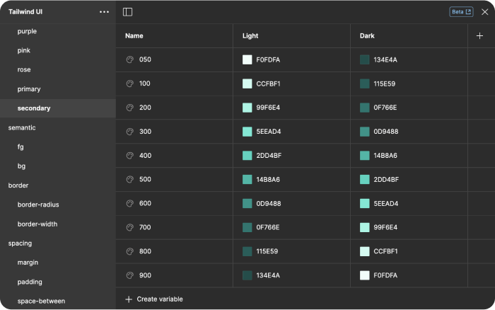
Primary Color
The primary color is used for branding elements and atoms including:
- logos
- primary buttons
- links
- things you can interact with
Secondary Color
The secondary color is used for supporting elements, including:
- badges
- avatars
- items with tool tips only
- things you should visually see called out, but w/o clickable interaction
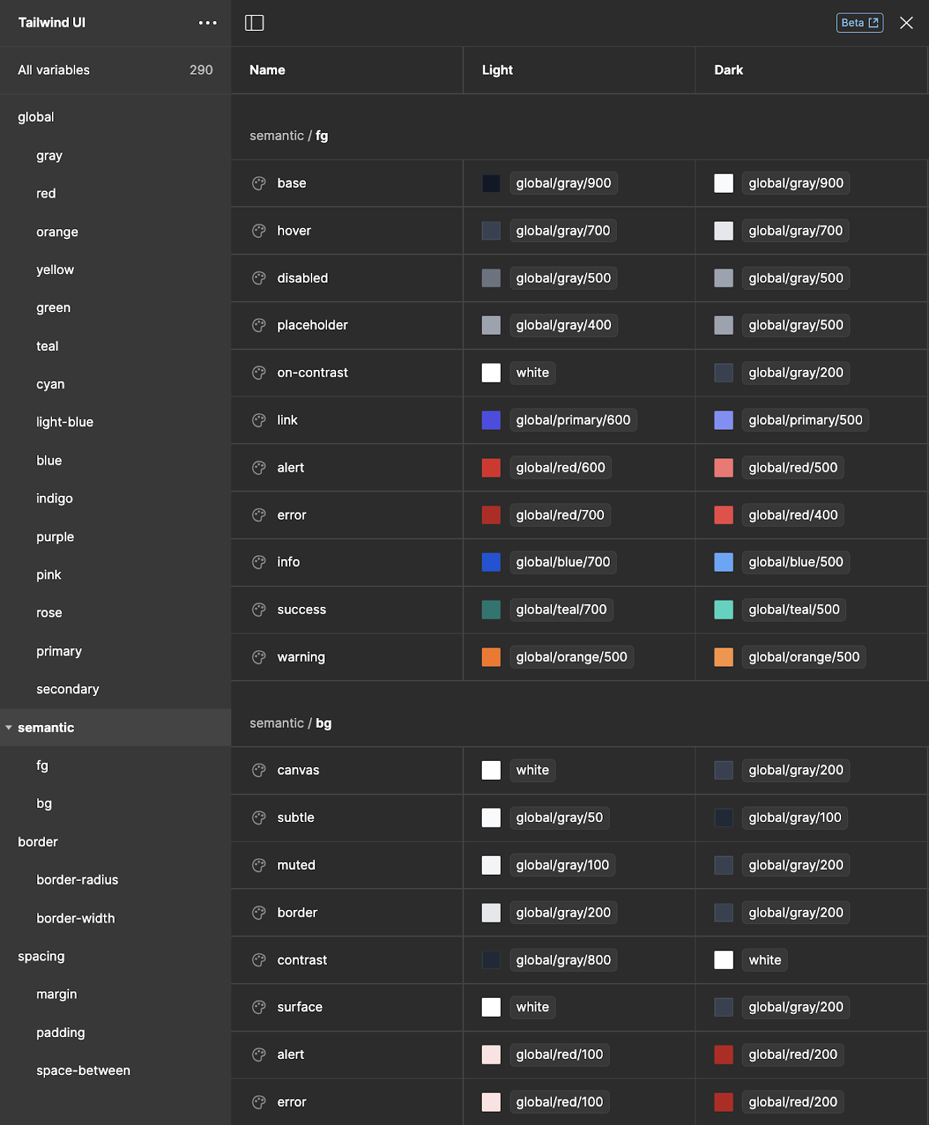
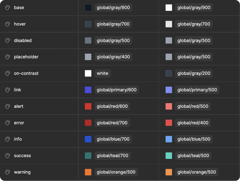
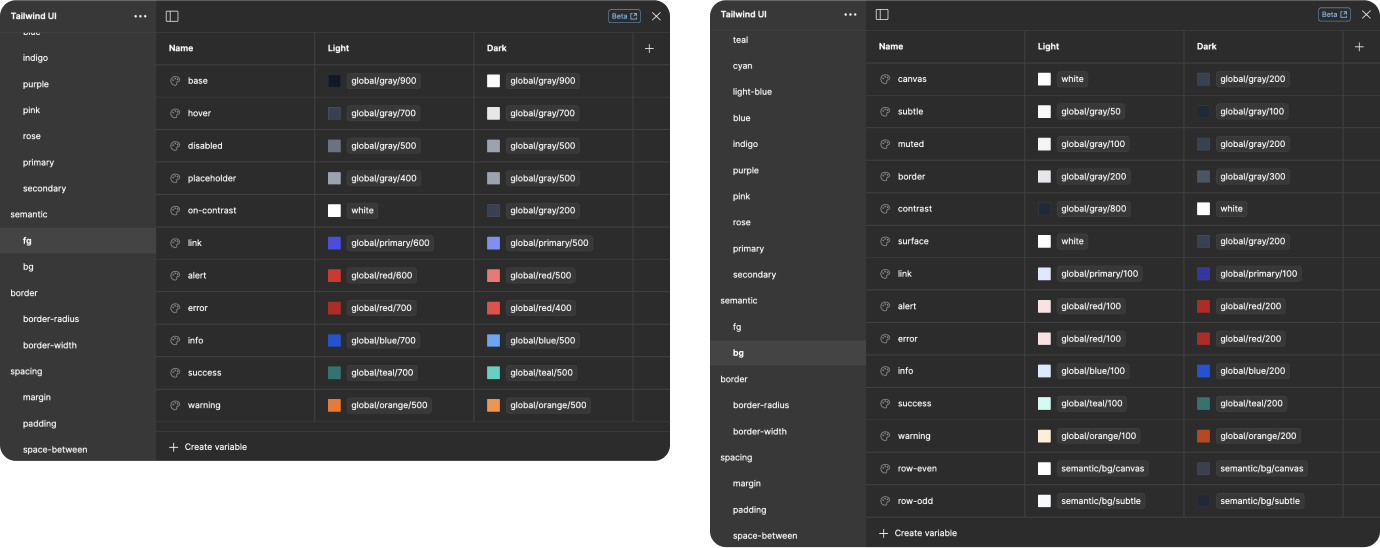
Semantic Colors
semantic colors are a set of color names that carry specific meanings or convey semantic information, making them useful for styling elements in a way that enhances accessibility, clarity, and user understanding. These semantic colors are often chosen based on their association with common concepts or categories, allowing designers and developers to communicate information more effectively through visual cues.
Foreground (FG) colors are primarily intended for font color or icon states, including hover, disabled, links, alerts, success, info, and more.
Background (BG) colors are complimentary colors to the FG colors, intended as lighter versions that are used in backgrounds for badges, alerts, and other components.
Additional semantic colors include background and foreground colors for:
- links
- borders
- even and odd rows (for zebra-striping tables and rows in other elements)
- canvas and surface
- subtle and muted for differentiating sections
Components
Philosophy
In our approach to building user interfaces, we employ a triad of techniques aimed at expediting the development process while ensuring maximum flexibility and customization. Firstly, we utilize variations to swiftly construct full components, allowing for rapid assembly of complex UI structures. Secondly, through replacements, we facilitate the seamless swapping of elements within these components, enabling quick adjustments to layout and functionality without the need for extensive reworking. Lastly, by leveraging properties, we empower efficient updates to individual atoms within the components, affording granular control over styling and behavior. These strategies collectively serve to streamline the UI development workflow, offering designers and developers alike the agility to adapt and customize interfaces with ease while maintaining a high degree of flexibility.
Variations
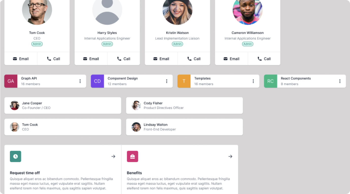
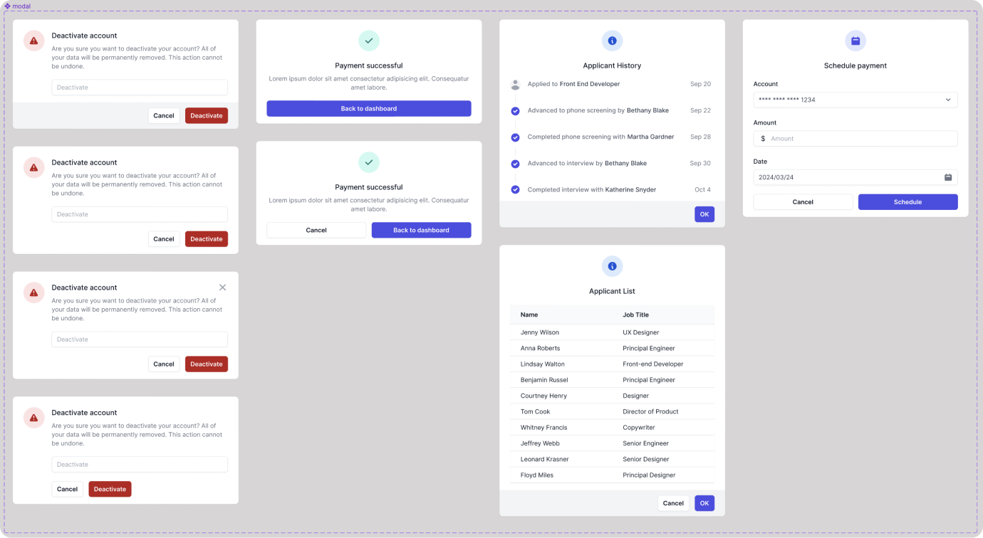
Components have multiple variations to allow for users of the library to quickly build a variety of screens to fit their needs. Most of the Tailwind UI examples are recreated here, as well as a few variations we thought were useful in building our own designs.
For example, when designing modals, we included examples that can include forms, feeds or tables. We also added a form field within the deactivate example in order to accommodate for companies who require the user to type in a phrase before they can perform an action.
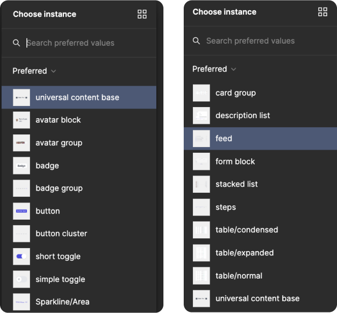
Replacements
Replacements within components are used to enable the user to swap out individual pieces of content for appropriately sized alternate atoms, elements, molecules, and templates.
For example, where the Universal Content Block (UCB) is used in smaller components, you can often swap to:
- avatar/avatar group
- badge/badge group
- button/button cluster
- toggles
- sparklines
- star rating
For larger content areas, templates are easily swappable to:
- card group
- description list
- feed
- form block
- stacked list
- steps
- Tables
This allows for a great deal of versatility within the individual components.
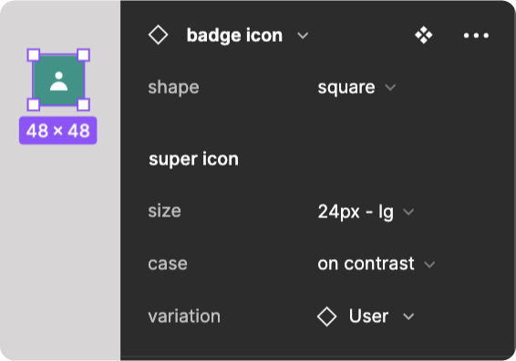
Properties
We have enabled all the properties for components, which offers an atomic level of customization.
For example, a badge icon enables you to change
- badge shape
- icon size
- icon case (color)
- icon variation
…all from the design panel.
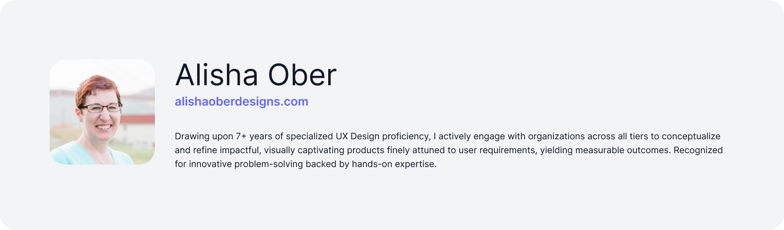
About the Designers